css

WP-5.6 Breaks My Themes

wp 5.6 breaks themes

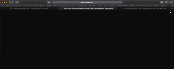
After updated WP-5.6, my search, home and others became black screen with a close x, but it can’t be closed. I needed to download WP-downgrade to reinstall WP-5.5.3 and everything is back to normal. This breaks both desktop and mobile screens.

How To Create Sprites and Use Icons with CSS

Final Icons Display

[lightgallery] Create a sprite with Instant Sprite: download the png sprite image and usage. [lgallery] [/lgallery] CSS codes: #return_top a,#youtube a, #bird a{position:fixed;bottom:1px;display:block;width:2.5rem;z-index:100001} #fixed_icons{background:linear-gradient(270deg,#ddd,#777 80%) no-repeat;padding:0 2%;position:fixed;width:100%;height:2.5rem;bottom:0;margin:0 auto;z-index:10001} #home_icon a{position:fixed;right:44px;bottom:1px;display:block;height:43px;width:44px;background:url(images/mysprite.png) -100px 0; no-repeat;z-index:100001} #return_top a{right:0;height:40px;background:url(images/mysprite.png) 0 0; no-repeat}#youtube a{right:90px;height:40px;background:url(images/mysprite.png) -50px 0; no-repeat} #bird a{right:135px;height:40px;background:url(images/mysprite.png) -156px 0; no-repeat} footer codes: <div id=”fixed_icons”> <div id=”return_top”><a href=”#masthead” title=”Go

Detect and Warn IE8 To Update With Responsive Themes

For web developers, Internet Explorer (ie6-9) have always been incompetent browsers and cause so much problems due to their incompatibility with conventional CSS. Many years later, the technology geared toward mobile devices and responsive themes are developed and make everything easier for desktop and mobile devices to use the same theme. There are still some

Min-Max-Width In CSS

I like fluid themes, all my themes are fluid, the other day playing with the min-width, max-width, and just width, I found out something interesting. My theme has 3 columns, 1 content in left column, and 2 sides bars in right column. If I set both of these width with max-width, the content will shrink

Re-sized Images Fail To Display On WordPress

I change and modify themes once in a while when I found some nice lay-out themes. Some themes cause my re-sized images NOT to display as the sizes defined in the editor WYSIWYG. It’s the CSS problem.      Open the css file and look for “.post img”, there are 2 settings can cause this problem.