
In order for the blogs or website to be popular, they must be mobile friendly since mobile devices are on the rise. I’m sure there are many efficient themes for WordPress that support mobile devices, but I like to create a simple one for my blogs using Twenty Ten WordPress theme. This is how I modify the original theme since it’s no longer supported and updated. The goal is to have a theme that adjust the viewports to accommodate all screen sizes to read clearly and easily with both fonts, images and videos. I did create 2 css’s: 1 for the index and 1 for the single
- For all screens width above 1280px, full screen design.
- For all screens width greater than 800px but less than 1280px, we should have sidebar and content resized to fit (35% and 65% respectively), the footer widgets (50%).
- For all screens width less than 800px, we should have content, footer, sidebar widths = 100%, we increase font size t0 105%.
- For all screens width max-width = 600px, include all smart phones, we increase font size 110%.

To solve Android browsers NOT scrolling, use <meta name=“viewport” content=“width=device-width, initial-scale=1.02”>, increase the initial-scale=1.02 instead of 1.0.
Or we can remove all “overflow: hidden” in the CSS.
Or we can use the script that I found on the web.
<script type="text/javascript">

window.onload=function(){

var ua = navigator.userAgent;

if(ua.indexOf("Android")>=0){

var androidversion=parseFloat(ua.slice(ua.indexOf("Android")+8));

if(androidversion<=2.3){

document.getElementsByName("viewport")[0].setAttribute("content","width=device-width, initial-scale=1.02");

}

}

};

</script>
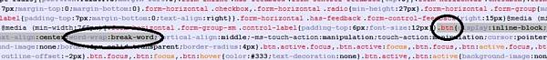
Bootstrap: word-wrap:break-word for collapsible button.
Find .btn, replace whitespace:nowrap with word-wrap:break-word;
Autosize iframe youtube to fit mobile = add codes to css.
embed,

iframe,

object {

max-width: 100%;

}
css for code
pre {

font-family: "Courier 10 Pitch", Courier, monospace;

font-size: 95%;

line-height: 140%;

}

code {

font-family: Monaco, Consolas, "Andale Mono", "DejaVu Sans Mono", monospace;

font-size: 95%;

line-height: 140%;

}

#content code {

display: block;

padding: 0.5em 1em;

border: 1px solid #666;

background: #0d0200;

color:#ffb499;

}
If we’re using fotorama and we want it to display the gallery in the center at all time, we need to add the codes
.fotorama__wrap {margin: 0 auto;}
For Body .custom-background using images or special color, we need to add codes
body.custom-background{

height:auto;

background: url('images/black_linen2.jpg')repeat;}
For numbers and bullets, we have to define in the css with codes
.entry-content ul li { margin-left:20px; list-style-type: circle; }

.entry-content ol li { margin-left:20px;list-style-type: decimal;}
I use FontAwesome for tags and stuff, I need to define them in the CSS also, make sure to load the FontAwesome.css in the head, change the font color to match the background.
.genericon:before,

.menu-toggle:after,

.featured-post:before,

.date a:before,

.entry-meta .author a:before,

.format-audio .entry-content:before,

.comments-link a:before,

.tags-links a:first-child:before,

.categories-links a:first-child:before,

.edit-link a:before,

.attachment .entry-title:before,

.attachment-meta:before,

.attachment-meta a:before,

.comment-awaiting-moderation:before,

.comment-reply-link:before,

.comment-reply-login:before,

.comment-reply-title small a:before,

.bypostauthor > .comment-body .fn:before,

.error404 .page-title:before {

-webkit-font-smoothing: antialiased;

display: inline-block;

font: normal 16px/1 Genericons;

vertical-align: text-bottom;

text-align:left;

}

.featured-post:before {

font-family: FontAwesome;

content: "\f08d";/*"\f308";*/

margin: 0 2px;

font-size:150%;

color: #fff;

padding:0 .5%;

}

.entry-meta .date a:before {

font-family: FontAwesome;

content: "\f073";/*"\f303";*/

margin: 0 2px;

font-size:150%;

color: #fff;

padding:0 .5%;

}

.comments-link a:before {

font-family: FontAwesome;

content: "\f086";/*"\f300";*/

position: relative;

top: -1px;

margin: 0 2px;

font-size:150%;

color: #fff;

padding:0 .5%;

}

.entry-meta .author a:before {

font-family: FontAwesome;

content: "\f007";/*"\f304";*/

position: relative;

top: -1px;

margin: 0 2px;

font-size:150%;

color: #fff;

padding:0 .5%;

}

.categories-links a:first-child:before {

font-family: FontAwesome;

content: "\f022";/*"\f301";*/

margin: 0 2px;

font-size:150%;

color: #fff;

padding:0 .5%;

}

.tags-links a:first-child:before {

font-family: FontAwesome;

content: "\f02b";/*"\f302";*/

position: relative;

top: -1px;

margin: 0 2px;

font-size:150%;

color: #fff;

padding:0 .5%;

}

.edit-link a:before {

font-family: FontAwesome;

content: "\f044";/*"\f411";*/

position: relative;

top: -1px;

margin: 0 2px;

font-size:150%;

color: #fff;

padding:0 .5%;

}
will continue