
I use responsive viewport tags for my blogs and they’ve been working every well across all mobile devices. I have a jQuery called imgPreview and it works quite well on Desktops and tablets, but not well on small devices like iPhones, Android Phones, iPod Touches. I created a footer-phone.php to remove all scripts that don’t work well for small width devices. Now I need to load the footer-phone.php for all small mobile devices.
WordPress has wp_is_mobile() that works quite well for detecting mobile devices, but I want the imgPreview to work with Tablets: iPads, Android and Windows tablets. Mobile_Detect.php comes handy since it detects phones and tablets.
This is how I did mine and it seems to work very well, imgPreview works on Desktop and iPads, Android pads.

- Download Mobile_Detect.php to the theme root folder.
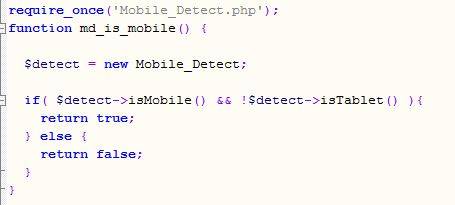
- Add these codes to Theme function.php. (credit to Astrotim)
require_once(‘Mobile_Detect.php’);
function md_is_mobile() {$detect = new Mobile_Detect;
if( $detect->isMobile() && !$detect->isTablet() ){
return true;
} else {
return false;
}
}
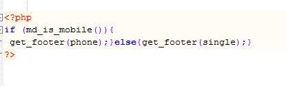
- Since imgPreview only exists in single page only, so we need to redirect footer-phone.php in Theme single.php.
<?php
if (md_is_mobile()){
get_footer(phone);}else{get_footer(single);}
?>
-
When the single.php is loaded, the function.php will check for mobile, desktop and tablet devices: footer-phone.php will be loaded for mobile, footer-single.php for desktop and tablet devices.

- Upgrade WordPress From PHP 7.4 To 8.3 Problems
- How To Embed HTML In PHP
- The Best Light Weight Responsive Themes For WordPress
- Serenti Theme for Word Press
- WP Ocius By Candid Themes